
Overview & Applicability
The Phenology Visualization Tool lets users explore observational data collected via the Nature’s Notebook program. Nature’s Notebook collects information on plant and animal phenology (seasonal change) across the U.S. with the help of individuals or groups that act as observers. The Visualization Tool provides access to this information through a map-based interface.
Users can see the number and location of records that have been collected for specific species and phenophases (seasonal events, e.g. flowering, hatching). They can filter data by year, species, phenophase, and/or partner group that collected the observations. Users can then plot data to explore the relationship between climatic or environmental variables like latitude, spring temperature, or precipitation, and species phenophase onset dates; or view data on species observations relative to one another. The tool does not make any predictions about phenology under future climate, but can be used for observing recent trends.
History
During 2010-11 USA-NPN enlisted Penn State University to implement a map based visualization tool intended to allow users to organize, view and visualize phenological data collected via the Nature’s Notebook website. In 2014, a new version of the Phenology Visualization Tool using updated technologies was developed through a contract with DJ Case & Associates. The first iteration of the Visualization Tool was published online in June 2015, following internal and external review by selected USA-NPN Partners. There are plans to add additional Visualizations, including a map overlay of the Gridded Spring Indices, and an incorporation of climate data into the Calendar Visualization.
Inputs and outputs
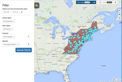
The tool is based on observational data that have already been collected using a status monitoring approach. Users need to:
- Select data of interest: filter data by year, species, and/or partner group that collected the observations.
- Select geographic area or layer of interest (optional)
Users can visualize this selected data in two ways:
- A scatter plot showing the relationship between selected phenological data and selected climate or abiotic variables. There is also an option to show a best fit line and R2 value.
- A calendar showing the annual timing of phenophase activity for up to three species and two years.
Users can then share a link to the map they have created, download images of graphs, or download the dataset they have filtered.
Restrictions and limitations
- Phenological observations are collected by a variety of people and organizations. Users do have the option to filter data by the partner organization that collected observations, if they want tighter quality control. They can also select only observations that are preceded by a negative observation, helping to ensure that observations are being collected relatively consistently.
- Filtering and plotting data requires the user to make very specific species selections; it is not necessarily easy to browse the Visualization Tool for general patterns and trends within a specific area.
- Once a user is ready to plot data for a species, it is not clear how many records exist for each species phenophase – for example, how many records were collected for ‘hatching’ vs. ‘live adults’. If a phenophase without many records is selected, the resulting graphs can be confusing or appear blank.
- Please interpret results with caution. Since users can plot multiple variables against one another, it is possible to generate a graph that has a good fit line, but is not displaying a meaningful relationship.
Accessing the tool and additional information
A brief written tutorial and a series of how-to videos are available at https://www.usanpn.org/data/visualizations